

USA Fencing announced via Facebook and the US Fencing web site that they are scrapping the USA Fencing logo that was unveiled at the July 2010 Board of Directors meeting and going back to the “classic” logo, but with the possibility of a few changes. (Insert your New Coke / Coke Classic joke here.)
US Fencing has even posted up a survey to find out which of 3 similar logos the membership feels is the best.
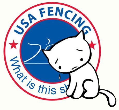
In the statement on USA Fencing’s site, anger towards the new logo was acknowledged: “Whether it said “Epee, Foil, Saber” or “Honor, Integrity, Agility” was not the main issue. It was the overall design – the lack of strength and grace – that was its true downfall.”
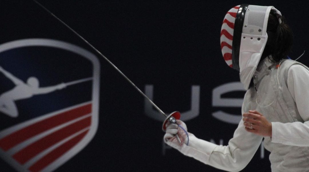
As soon as the new USA Fencing logo was announced at the July 2010 Board of Directors (BOD) Meeting of US Fencing, negative comments on the logo’s design started to flow. The discussion (and rants about) the logo, and speculation as to the overall cost of the logo and rebranding efforts ran rampant.
Following the latest email from USA Fencing reminding members of the close of registration for the first North American Cup of the 2010-2011 season, comments flowed again as the logo was updated from stating “Foil Epee Saber” along the bottom of the circle to “Honor, Integrity, Agility”. The ability to change out the wording on the bottom half of the logo was highlighted as one of its strengths during the BOD meeting.
While speculation on the actual cost of the logo design ran across a great range, the actual cost of the logo design was $9,600 and the cost of the collateral already produced, and to be used during the 2010-2011 season is approximately $15,000.
Related Forum Threads: