Note: A few days after the initial launch of the USA Fencing site many of the errors highlighted in this article have been corrected.
US Fencing launched a new version of their web site today and it seems to have been built without thought to the multiple audience personas that would benefit from the information contained on US Fencing. On my first glance, this launch is aimed at the active national fencer / fencing fan. Unfortunately the site relaunch has left other audiences with a site that is broken for many searches and not necessarily any easier to use.
growing number of users visiting USA Fencing’s platforms on cell phones and tablets
Goal: Make usfencing.org more user friendly
Mobile Responsive
Intuitive User Interface
Looking at my traffic report for the end of 2015, I discussed how mobile should impact future design: “Mobile currently accounts for 32% of site traffic, but the mobile experience on Fencing.Net is shoddy. The forums require a separate application and the wordpress theme is using a stock mobile theme. Engagement on mobile devices would probably increase with dedicated mobile themes and a better responsive design. That’s going to go on the list of items to be prioritized.”
Based on my data and US Fencing’s data, building the site to be more mobile-friendly is a great goal to have. So what launched on the Sport NGIN platform for US Fencing?
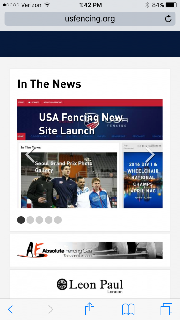
Here is the current site on an iPhone6:
The US Fencing home page on an iPhone 6
Looking at use cases for US Fencing – When I research the SEO data for USFencing.org, it ranks high in the search engines for informational terms like “fencing rules” “where to fence” and even “fencing videos”.
What happens when a non-fencer comes to the mobile version of this page? How can they find out about the sport (the basics) and where to take a class?
What about a referee looking for a current version of the rulebook?
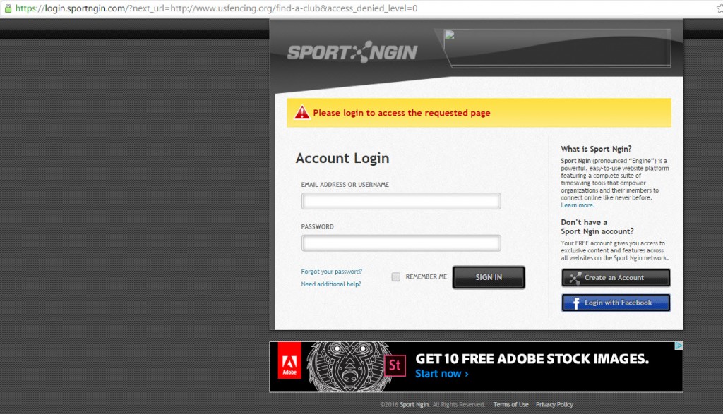
Testing doesn’t look to have been fully completed by the QA testers for this site relaunch as “find a club” requires a registration and login to the Sport NGIN system. The same error exists when you hit the site from Google searches for “fencing rules” and “fencing videos”.
The “Find a Club” link in the footer of the new US Fencing site
This error screen pops up when clicking on the footer link for “Find a Club” and is also the landing page for “fencing videos” on Google.
So based on this new design US Fencing is alienating non-fencers by:
Making the information on basics of fencing and finding a club hard to find
Making the user perform additional actions to get basic information (sorry, I’m not creating an account just to use a “store locator” function.)
In addition, while the usfencing.org page passes the automated Mobile Friendly test, the site is not mobile friendly as there is no user navigation available on the mobile view. (The menu items are impossible to
These are challenges I face over at Fencing.Net as well. I’ll be the first to admit that the navigation and organization on Fencing.Net leaves a lot to be desired but “Fencing Clubs” has always been a top navigation item and it’s always been one of the most visited pages on the site. Why? Because a significant portion of site traffic is New Users who are probably looking for information on fencing – what it is, is it safe, where to try it out.
US Fencing serves multiple audiences and each have specific needs and desires for a web site, but one “persona” may be driving the design and information architecture more than the others because they are (1) more known or (2) more vocal.
A holistic approach to assessing current content (by traffic and search visibility and internal site search), building audience personas, and testing how each persona can achieve their goals on the site is critical to long term success online. The solution may be purging and simplifying navigation based on task to complete or creation of separate microsites each targeted at a specific persona.
Overall, more attention needs to be given to the multiple goals of an organizational web site.
In my years working on ecommerce sites and not with a large hotel company, I learn a lot by looking at what other industry leaders do. When I have a question about ecommerce optimization, I look to steal ideas from Amazon.com.
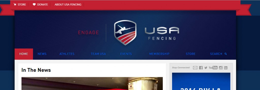
Here’s the current header for the US Fencing site. Note that there is a lot of space given to the logo where the color scheme seems to blend in to make the text hard to read – red logo text on blue background – plus the navigational links are light blue on a dark blue background.
In this case, I’d look to some other sports – like Little League Baseball. Their site does a great job in funneling different audiences directly to sections of the site relevant to them. The Main navigation is based on Audience (who is using the site) instead of Task/Category (what the information is):
Top navigation based on audience type
The navigation and layout on LittleLeague.org gives me an intuitive place to start based on if I’m a Parent, Coach, Umpire, or Player. This is a way of organizing information that I want to figure out how to use on Fencing.Net. It makes sense but requires more work in tagging and classifying the existing articles as well as finding the gaps in current information.
Based on what is live, here are the first 3 steps I would take:
Audit current pages on the site via a web crawler to identify what pages are now hidden behind the Sport NGIN login wall and fix those immediately
Put in an immediate fix for mobile navigation. Mobile was the declared reason for the site update but there is no usable mobile responsive menu
Figure out an update to the main navigation color scheme so that it’s obvious where users should click
US Fencing stated in their release that this is just the first update to their site. With an iterative process improvements should come. I just hope that they hold their vendors accountable, immediately fix the glaring issues over basic access to public pages, and run future launches through some web crawlers to validate the site before launching to ensure that each launch is enhancing the experience of users for the site.